- Sector
- Creative studio
- Type
- Portfolio site
- Year
- 2026
- Built with
- Figma, HTML, CSS, JavaScript
- Address
- hussylevente.github.io/primo
- 4
- Screens
- 5
- Services listed
This one is a concept build. The site is live and you can open it, but the brand behind it is invented and the photography is stock. I built it to prove the thing works end to end — not for a paying client.
See it work.
 Walkthrough recording soon
The project in three parts
The problem
A studio portfolio has one job and a hard constraint: show the work, and do not compete with it. Most solve that with a grid — which flattens every picture to the same size and so says nothing about what the studio itself rates.
What I built
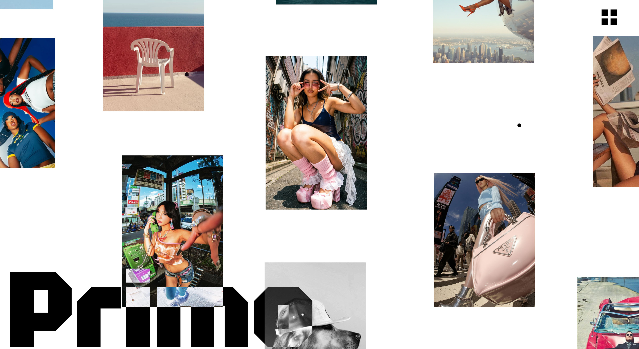
The home page is a scattered wall instead of a grid: pictures sit at different sizes and depths on white, and the wordmark runs underneath them at display size so type and image share one plane. Four screens in all — the wall, the work, the studio and contact — plus a full-screen menu that drops the navigation in at the same scale as the logo. Inertial scrolling throughout, and a cursor that answers whatever it is over.
- Scattered image wall instead of a grid
- Wordmark set at display size behind the work
- Full-screen menu at the scale of the logo
- Inertial scrolling and a reactive cursor
What it was worth
Scale does the editing. What the studio rates gets more room, so the first screen takes a position before a single caption has been read — which is exactly what a portfolio is for.
Every screen, full length.
Click any screen to open it full size.
Want the same for your business?
Tell me what your site has to achieve and roughly what you can spend. You get a fixed quote and a delivery date in writing — before anything starts.
- hello@blckt.hu
- Phone
- +36 30 255 2432